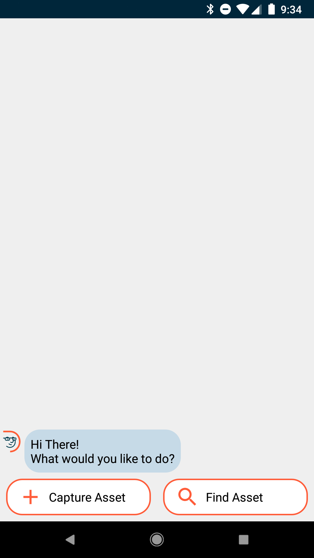
Make entering assets a breeze!
Velox Case Study
Dude Solutions wanted to bring their maintenance work order tracking suite to the next level by utilizing predictive analytics. There was only one problem - they had no data to mine.
As a member of the Dude Labs innovation team, we needed to quickly validate if creating a companion app to collect this data would be a viable business concept.
We built the app from scratch in 6 months. I led all the design initiatives and collaborated with our clients to ultimately move our MVP towards a beta launch, including working on logo, marketing and pricing. I even learned some Android code to speed up making UI polish.
Our team used different, radical UI techniques with map based tracking, optical character recognition and a conversational interface. This approach was rooted in serving a user base who were not very technically savvy (some just switched from using a flip phone in the last few years!) As a result, we relied on the basic smartphone concepts that they were actually familiar with like texting, using the GPS and taking a picture.
Key Points
Pivot after field test with version 1
During our first week as a team, we locked ourselves in a meeting room and sketched out all of our conceptual ideas. Our goal was to determine what we could deliver as a first version within a week or two, so we often looked at three different levels for any new feature.
We always started with the ideal version, which was just thinking blue sky. To determine what was possible, we would ask ourselves the question, "what's actually feasible with the technology we have" and that would help filter out some ideas. The third step is to pare the feasible down even further in what would be attainable the quickest in the time box we set.
Once we had refined and narrowed our initial vision, we built a working app and immediately went to test the concepts viability onsite with a school. The school was having an engineering condition audit performed by one of the company’s partners, who we were targeting to use this app.
After climbing up onto roofs to see where the HVAC units were and having some of the engineers test out the concept flow, we had found out 2 things:
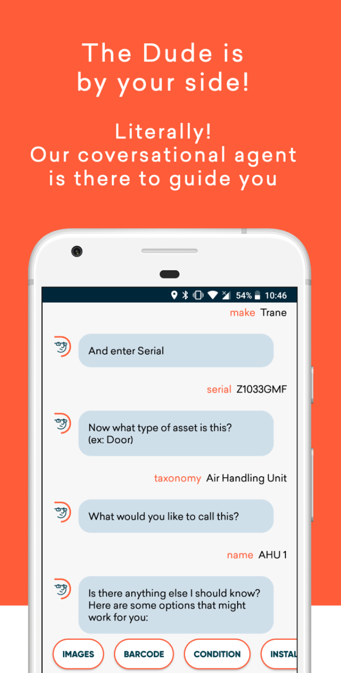
- The conversational flow showed promise in the ability to quickly handle gathering the minimum make, model and serial number. We had tested with some of the school’s staff and unprompted, they were able to complete the flow in only a few minutes.
- Our intended audience had to change as the engineering partners had developed their own forms and processes that they used to input the assets data due to their focus on reporting back on budget values, which were not a major concern for us at the time.
Client Research Program
In order to facilitate further user research so we could move quickly, I established and built a client research program for our team. This involved partnering with different customer facing teams like Client Success, Sales & Help Content in order to get our message across different channels to find volunteers.
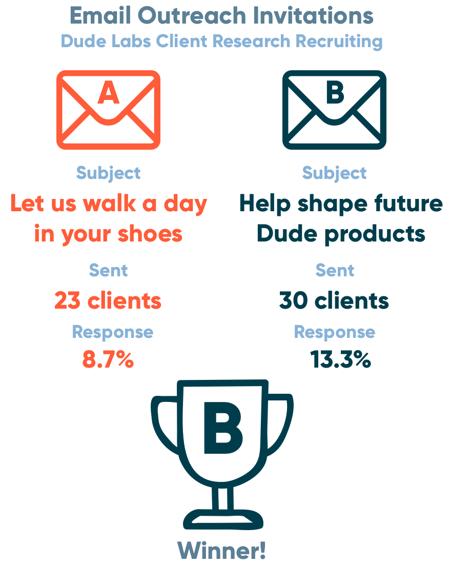
By setting rules around which clients were off-limits due to deals being signed and other scenarios, I was able to curate small batches of potential clients to email and recruit. This involved testing out different subject lines and email content in order to find what was most relevant to getting people to sign up.
Through A/B testing I increased the conversions and gathered a sizable list that I could reach out to at a moment's notice for things like surveys, usability testing and finding alpha testers.
Conversational Interface
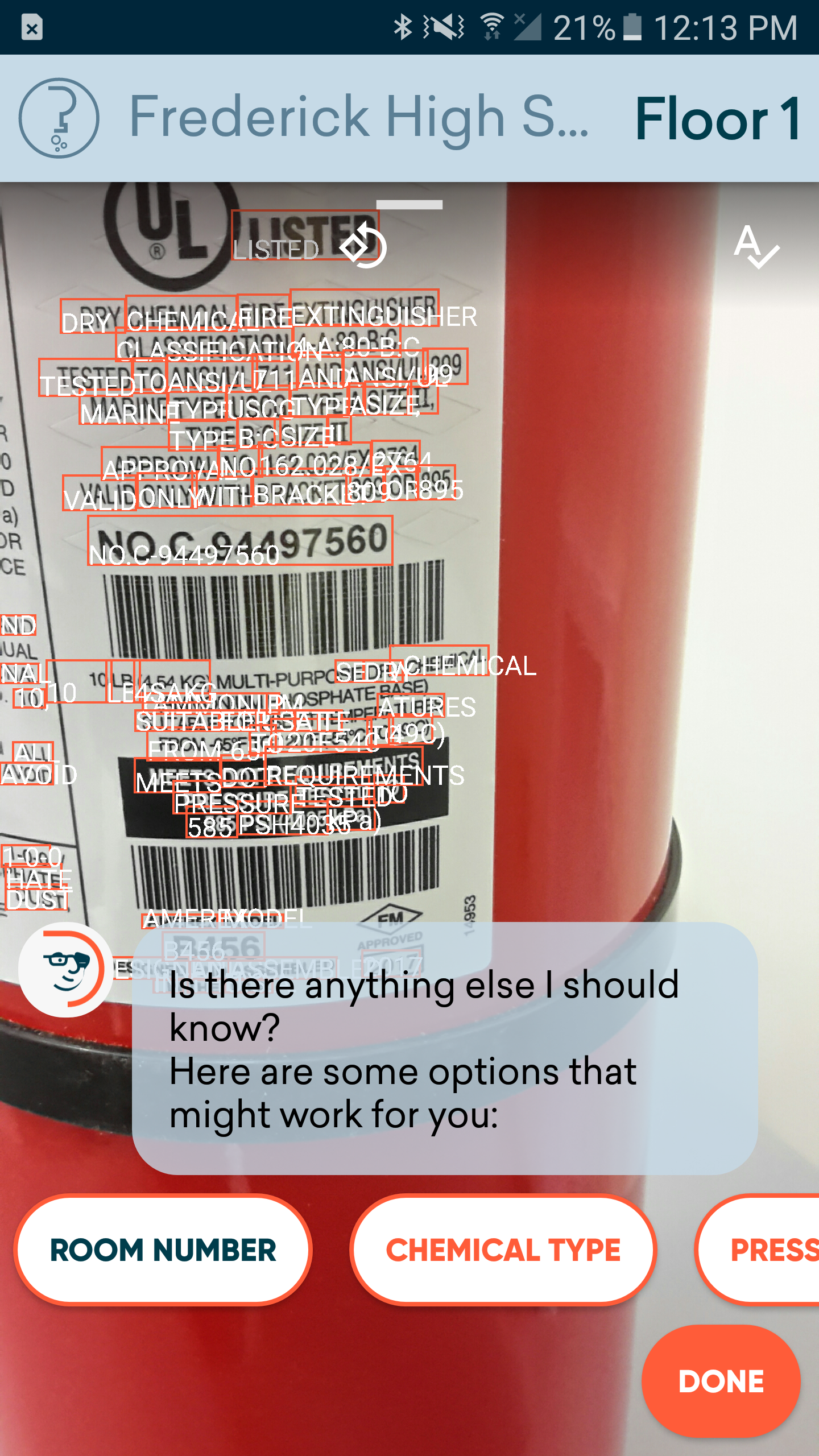
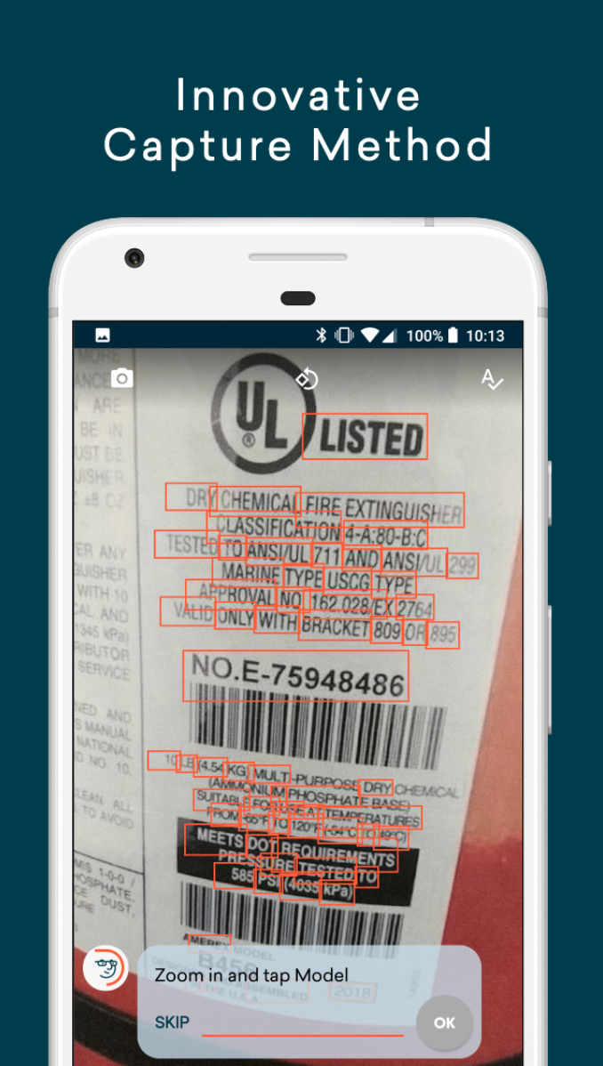
Another thing we wanted to do was to improve upon the standard web form that was in the current product suite. Our goal was to have an experience where you did not have to type at all.
So we chose to use optical character recognition for that you snap a picture of the name plate of any type of equipment and it would read in the text and then the conversational dude agent would ‘talk’ to you and let you know what he wanted to you to fill out so it would read all the text in how all these boxes on the on the picture and then you would actually just answer the questions with whatever info you needed and it copies it down.
It's really accurate so people don't have to type in 16 digit serial numbers that they would often get wrong. We don't make anyone feel bad about being human since people make mistakes when trying to type those in and be accurate.
Another thing that we learned was around the conversational language that we had to improve was the key text around the fact that the picture actually update live if you zoom in and zoom out. It was something that we were stuck on for a bit and we had to go through to really find the actual text that would make it intuitive in order to have users make sure they actually knew what they could do.
That the text would update and you could get closer to a really small piece of text that you want to copy into the flow.
Floorplans and Dropping Pins
Once we had the main asset flow built, we needed to expand the feature set of the app. This included the ability to track points of interest of equipment inside buildings. The initial concept had promise, but after testing we found that the first step of precisely pinpointing where the equipment was located needed improvement.
Accurate pin locationsDuring testing, we received a lot of feedback that users were expecting to be able to drop the pins location by tapping their finger on the screen. However I had a hypothesis that this might not be the most accurate method.
We devised a simple test that had multiple methods of setting the pins location on an html canvas app that calculated accuracy of the coordinates. We performed robust internal testing with staff around the office to gather test data. Once the data came back we found that tapping your finger was not accurate because your finger was over top the pin and it was harder to see.
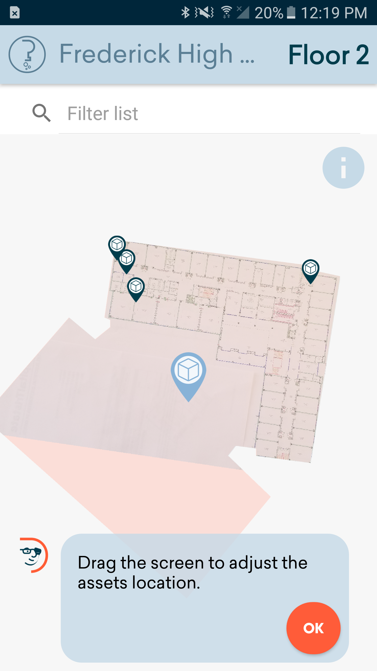
As a result, we changed our input method and opted to keep the pin in a fixed position, while instead moving the background polygon around. This produced much more accurate results and ensured users could quickly get the asset location in the precise spot they wanted.
Building OrientationOnce we had a clear method to put assets locations on the map, we also noticed that users were having trouble orienting themselves inside of a building. The most common thing I observed when people would use the app was that they literally would pause and look up around the room when they had to figure out where they were inside a building. It was hard for them to determine directionally what corner or area they already were in.
We knew that just a blank polygon of the building shape was not giving enough context for them to figure it out. A quick idea we had was to add the ability to transpose am image of a floor plan onto the polygon to give more context. This idea was much more attainable then going down a CAD drawing based path.
We utilized the camera features we had already built out to allow the captured photo to be manipulated onto of the building polygon. Once we tested this with users, it was easily validated that this helped someone find Room 123 when they could have an actual drawing to look at.
Flexible data attributes backed by Machine Learning
The main goal was that we wanted technicians to capture first was just make/model/serial # which was pretty straightforward for them but we had a significant taxonomy system that was backed by a Machine learning algorithm which allowed us to recommend based on the asset categories.
For instance a HVAC unit has things like CFM and filter size to know how much air is pushing but a motor has things like amperage and RPMs and those are totally different. We didn't want to have a really long list of choices so we wanted to recommend it based on the types of assets they selected.
It would display a list of optional attributes that they could enter and this would learn based off of their organization itself. So if everyone always wants to track one informational field on a type of equipment, it would always show that one.
It would also learn based off the whole company cloud of user data where if these assets are vastly different across the board because it represents such a big spectrum of types of equipment, so it would constantly be fed more unique attribute types to parse through and present back to users.
The algorithm would present them with a list of things that could track in addition to standard ones like just taking a picture of the unit itself, or scanning a barcode that they want to track, or condition tracking to say this is a new unit or this is something that's been around for 20 years and we know it's going to be on its last legs.
Say we have something like a fire extinguisher you can track the chemical type and some of those are different and it knows the previous chemical entered and can pre fill in some of the answers based off of most common ones, again to limit the the typing experience on the whole.
